This past week I’ve created a Tableau dashboard page (https://public.tableau.com/views/CNNCOVIDDataOverTimeAJF1/Dashboard1?:display_count=y&:origin=viz_share_link) from CNN data (https://www.cnn.com/2020/03/03/health/us-coronavirus-cases-state-by-state/index.html). I’m updating it regularly; now it has trendlines (if you hover over the line you can see the slope and R^2 for each state). Overall, the exponential model fit better (R^2 = 0.97) than the linear model (R^2 = 0.71). I used yesterday’s data to create an expected set of data for today and compared that to the actual results. The figure below (made in MS Excel, so I can add it here) has the results. Many states and territories are pretty far off, though, several (~20) are within 5%.
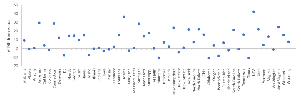
Points above the line the model predicted MORE than the actual number of cases, for points at the line, the model predicted the SAME; for points below the line the model predicted FEWER than actual. Overall, the model predicted 13% more cases than actual. I suspect every day I add new data, the models will perform a little better at predicting the next day. We should soon see if the sheltering in place measures have had any effect, though I’ll let you determine that for yourself.

Leave a comment