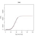
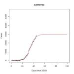
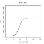
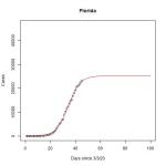
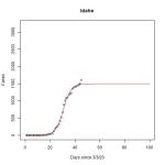
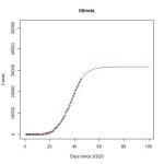
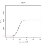
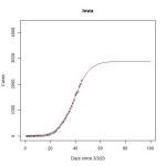
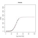
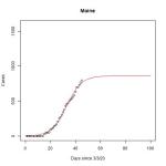
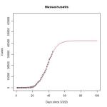
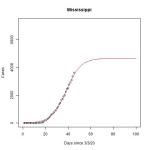
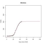
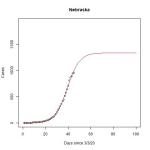
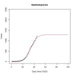
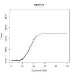
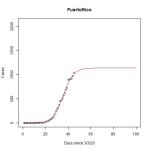
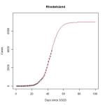
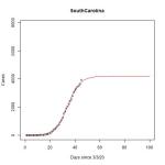
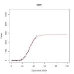
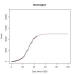
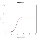
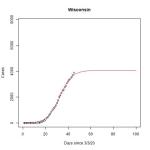
I was playing around in R and found a logistic regression function. Logistic regression means the curve starts off exponential, but levels off after time. I’ve created some basic graphs to fit the data from the CNN curves I’ve created here. You can click on a state to see a bigger image in a new window. I have been intermittently running the data. The last time was nine days ago (4/7/20). This seems to be a pretty bad model of what’s going to happen next, given that we haven’t been in a logistic curve yet. The previous iteration was relatively similar to this one (less than 20% increase in estimated total cases) in 18 states/territories (AZ, CA, DE, Guam, HI, ID, LA, MI, MT, NE, NH, NM, USVI, UT, VT, WA, WI, WY). The models were off by 20-40% in 26 states/territories (AK, CO, CT, DC, FL, GA, IN, KS, ME, MO, NV, NJ, NY, NC, ND, OH, OK, OR, PA, PR, SC, TN, TX, VA, WV, Total). The models were off by 40-60% in 8 states (AL, AR, IL, IA, MD, MA, MN, MS). Finally, the models were off by more than 60% in 2 states (RI, KY).
As you can see below, most models predict slight increases in new cases. Keep in mind, this is based on NOTHING biological or epidemiological. This is just fitting a line through the data we already have. It does not account for Easter, it doesn’t account for weather, it doesn’t account for travel bans. This is strictly to help visualize what has already happened, and what might possibly happen.


Leave a comment